Silverbullet redesign
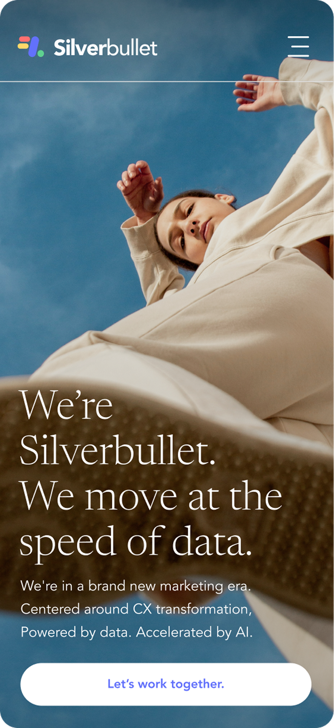
A new visual system and responsive website UI to help Silverbullet compete in a consultancy-led market, built around motion-led photography and tighter typography.
UI – Brand - Art Direction
2024
marmalade
Intro
Silverbullet helps brands use first-party data and privacy-first targeting to grow in a post-cookie world. Their website didn’t match the level of work they do. The brief was to refresh the visual system and redesign the site so Silverbullet reads as an enterprise-ready partner, against the backdrop of a competitive MarTech landscape.


Core idea
Behind every customer data point is a person. The new direction makes that human reality visible, using motion to show how customer journeys shift and change. This became the filter for every image, layout and headline

Motion led photographic system
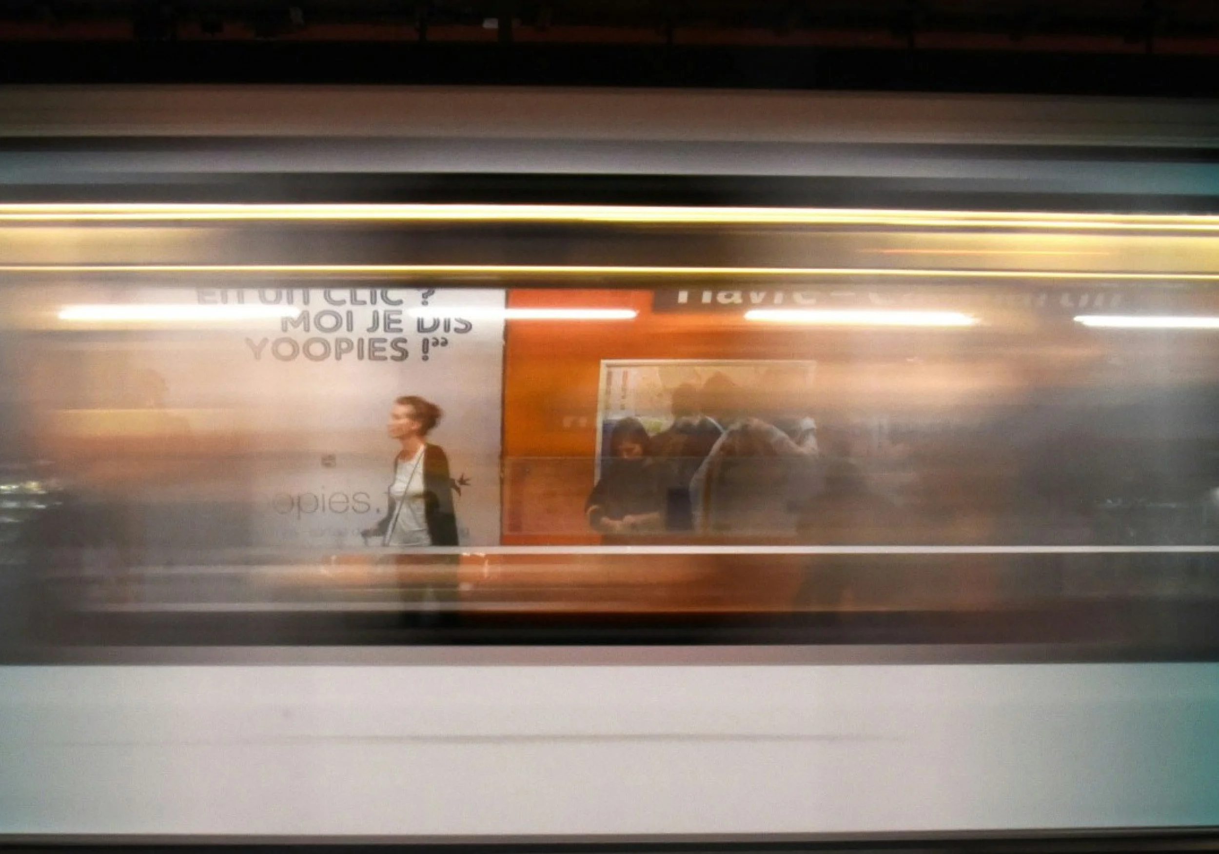
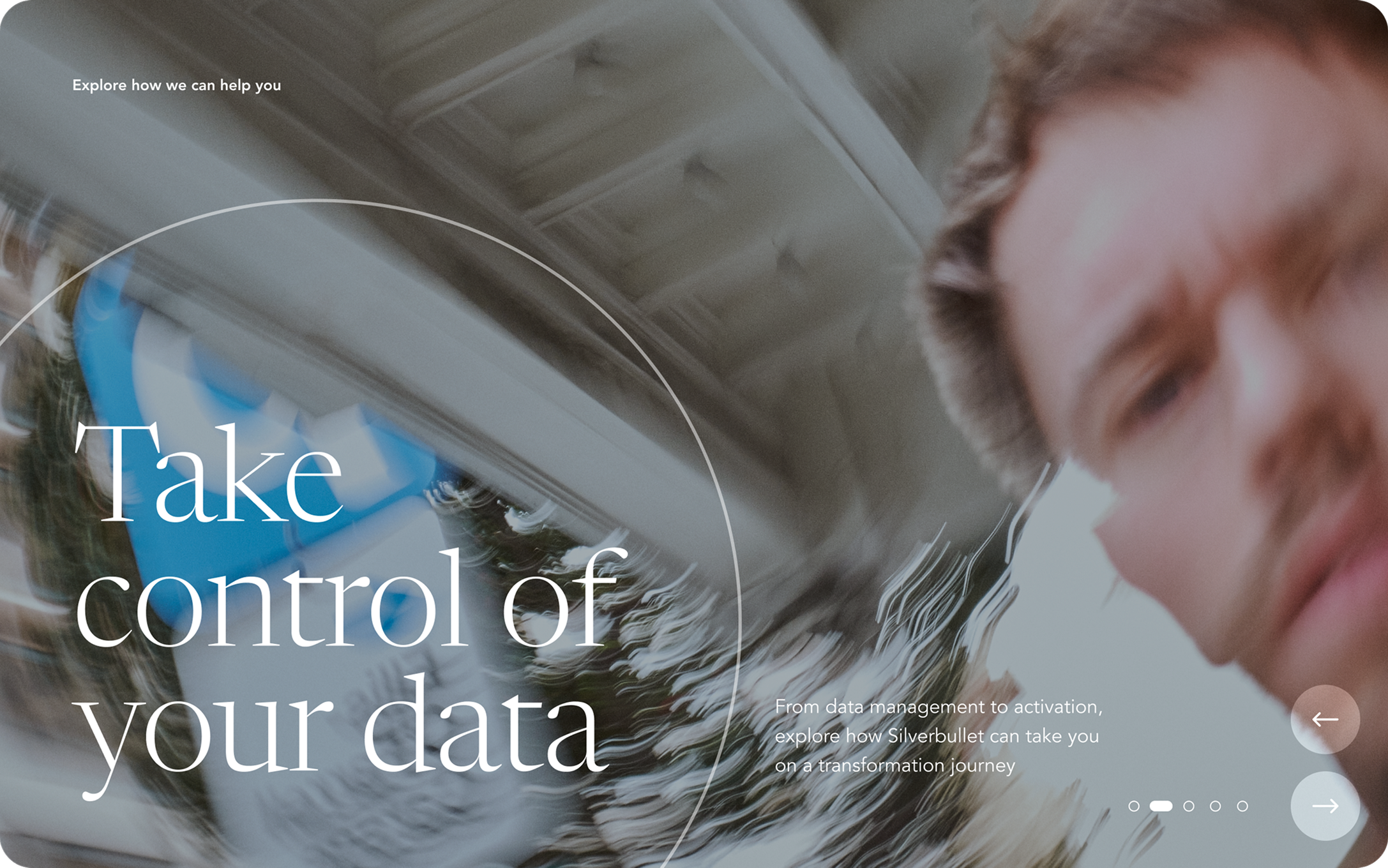
Silverbullet’s work is abstract unless it’s anchored in something real: real customers, human data. The visual system makes that idea tangible by treating ‘data’ as movement, captured in-camera, not illustrated. This simple rule-set kept the library coherent and recognisable across web, socials and sales decks.
Data convergence
Crossing movement to signal patterns forming and decisions emerging.

Data flow
Side-to-side motion to signal momentum through a customer data journey.
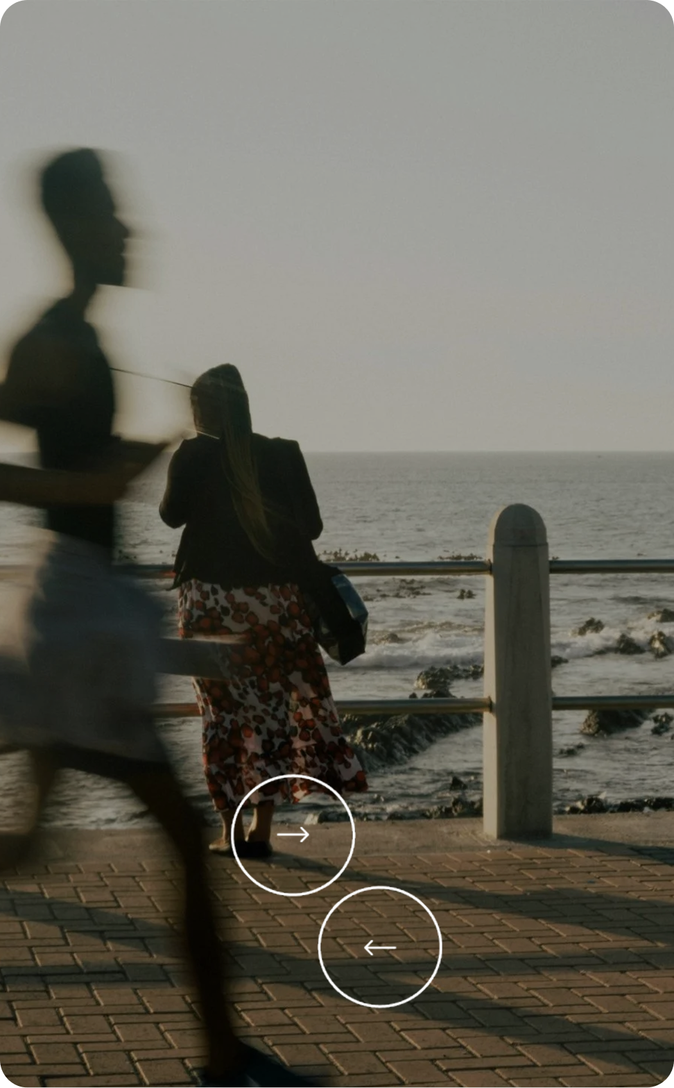
Data exchange
Vertical motion to suggest transfer of data through layers, protocols and systems.
Motion Photography image library
A small, reusable image library was created to keep the motion aesthetic consistent after launch.




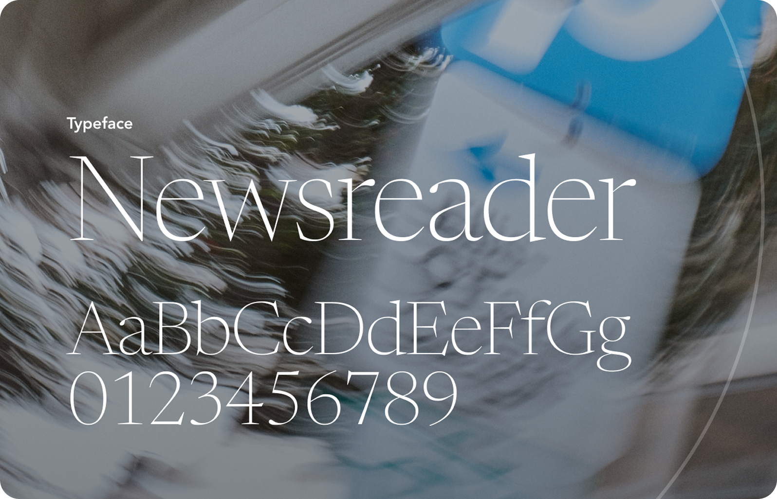
A new typeface to signal capability
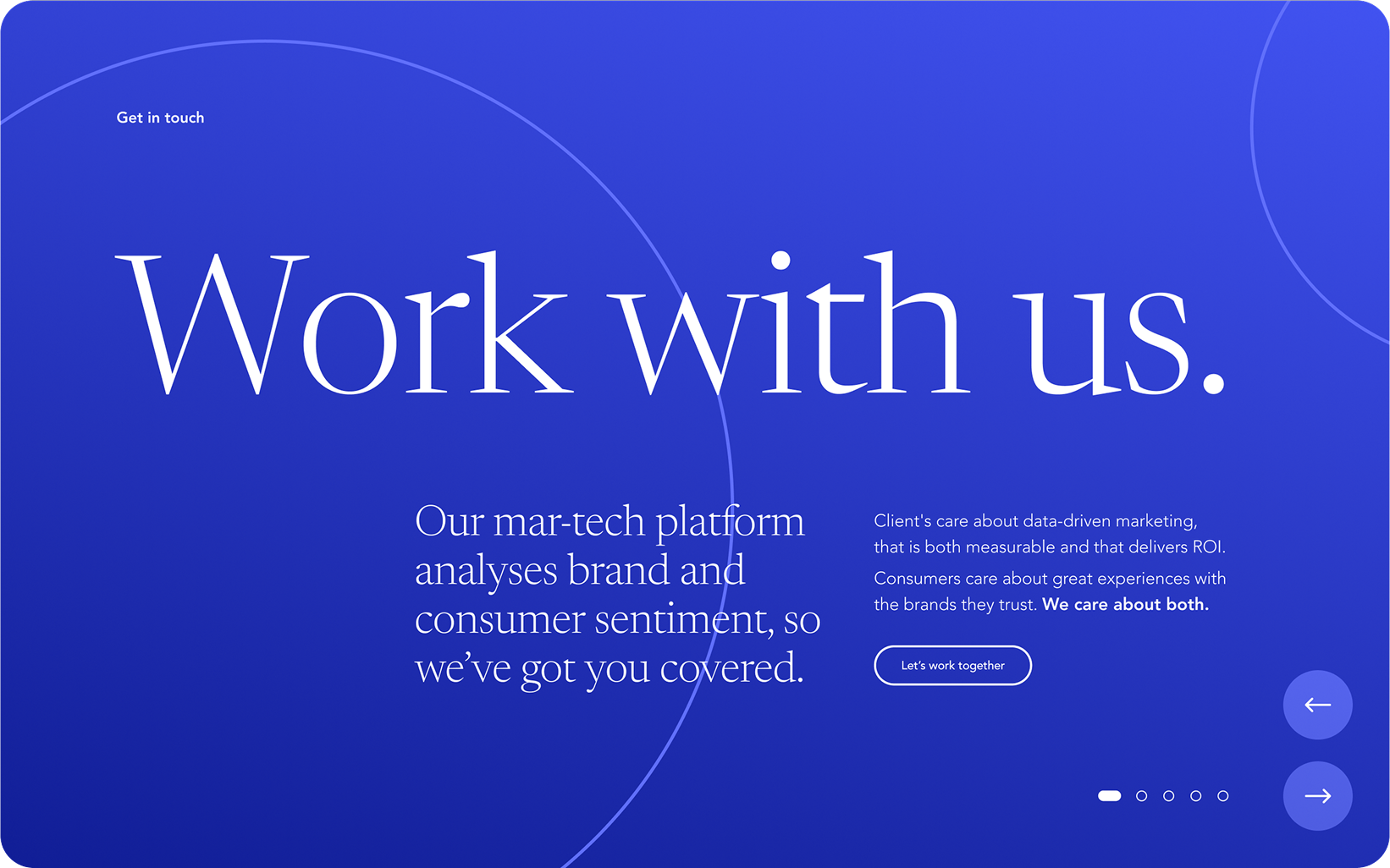
A new typeface and hierarchy shifted the tone towards consultancy-grade clarity: calmer, more precise, and easier to scan. Paired with the motion imagery and retained shape language, it lifted the brand without losing recognition.

Shape
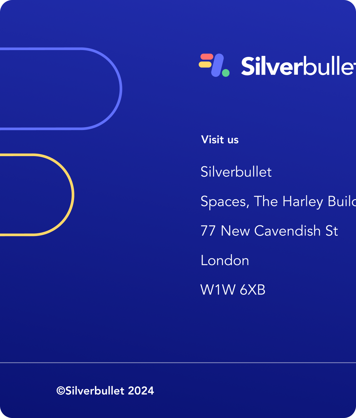
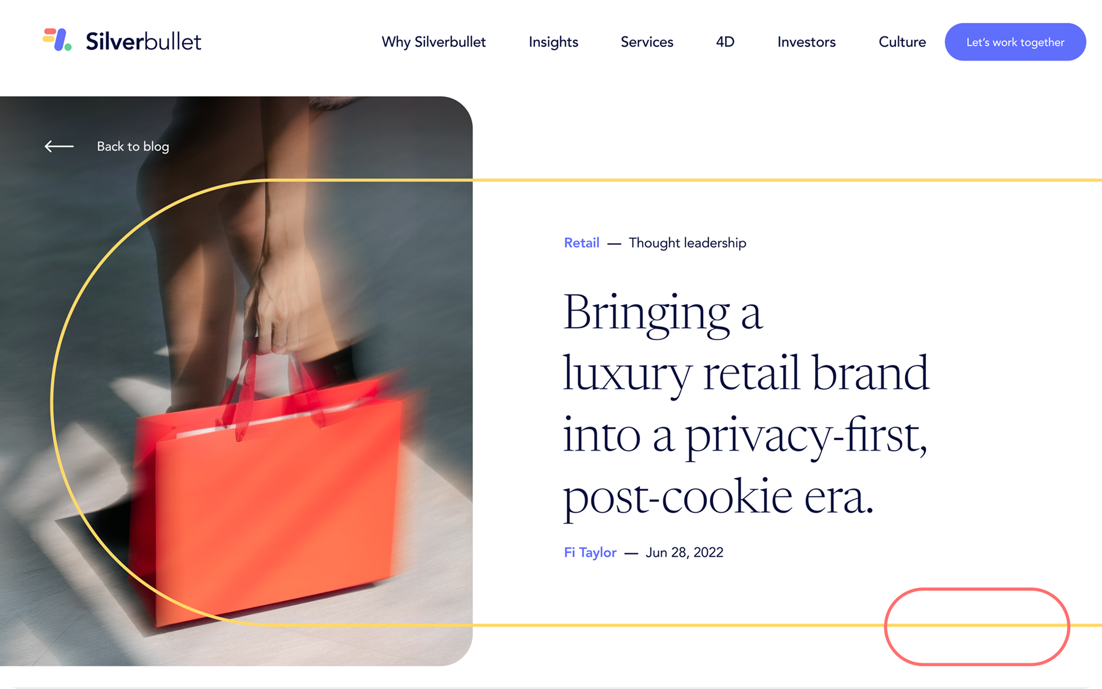
Silverbullet already had a playful shape language, so the refresh kept it to protect recognition. The difference was discipline: fewer shapes, better spacing, and used as a quiet overlay to add structure without stealing focus from the photography.
Design outcome
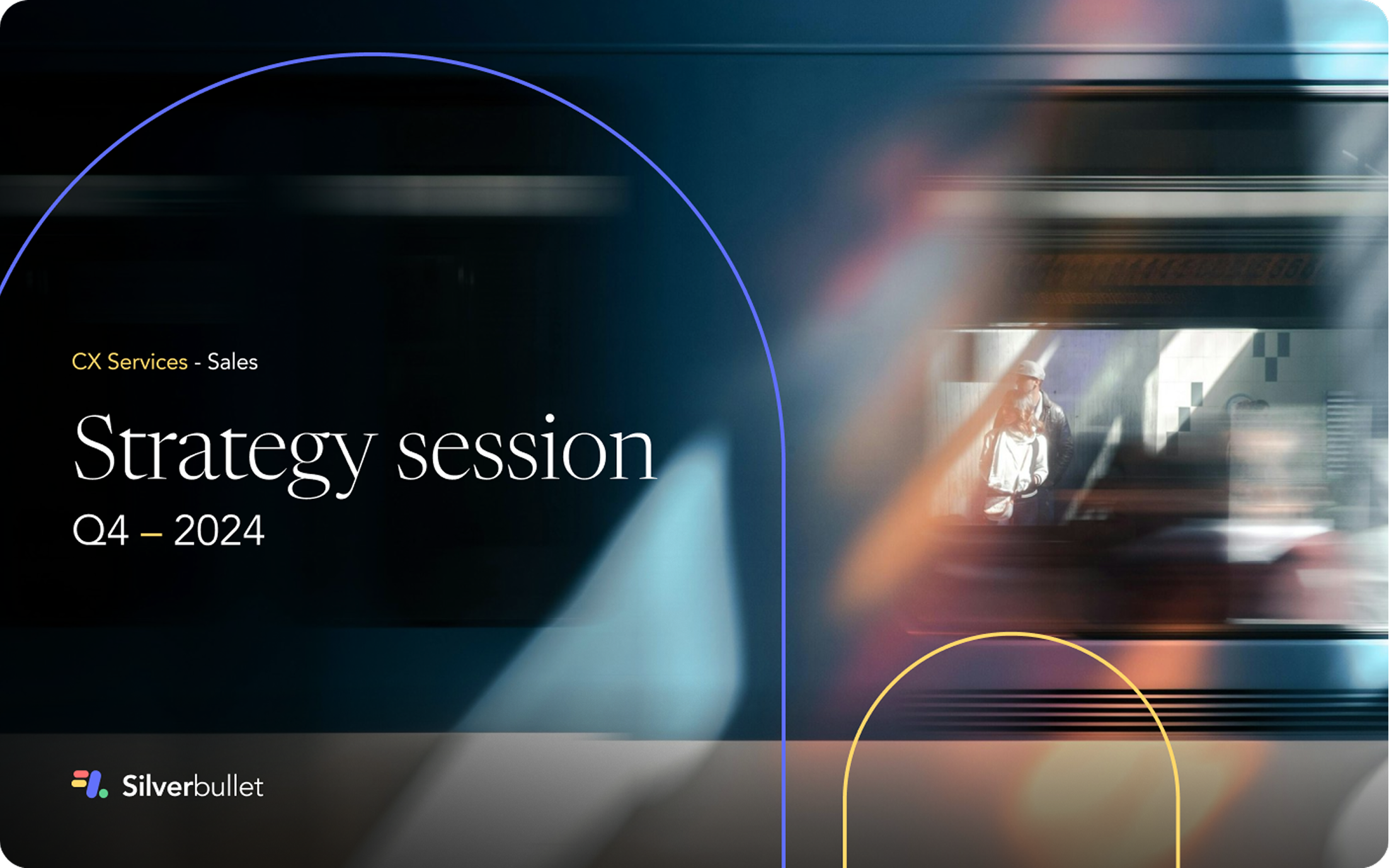
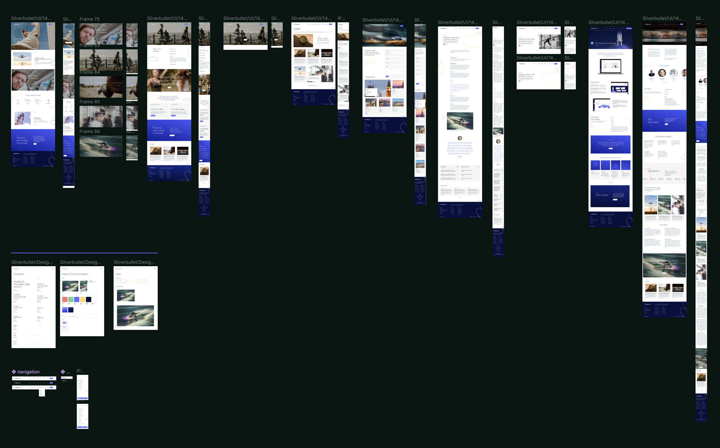
A refreshed visual system and responsive site that made Silverbullet feel like a more credible, consultancy-adjacent partner, without losing the brand’s existing character. The photography and layout language carried beyond the site and stayed in use post-launch.



Rollout
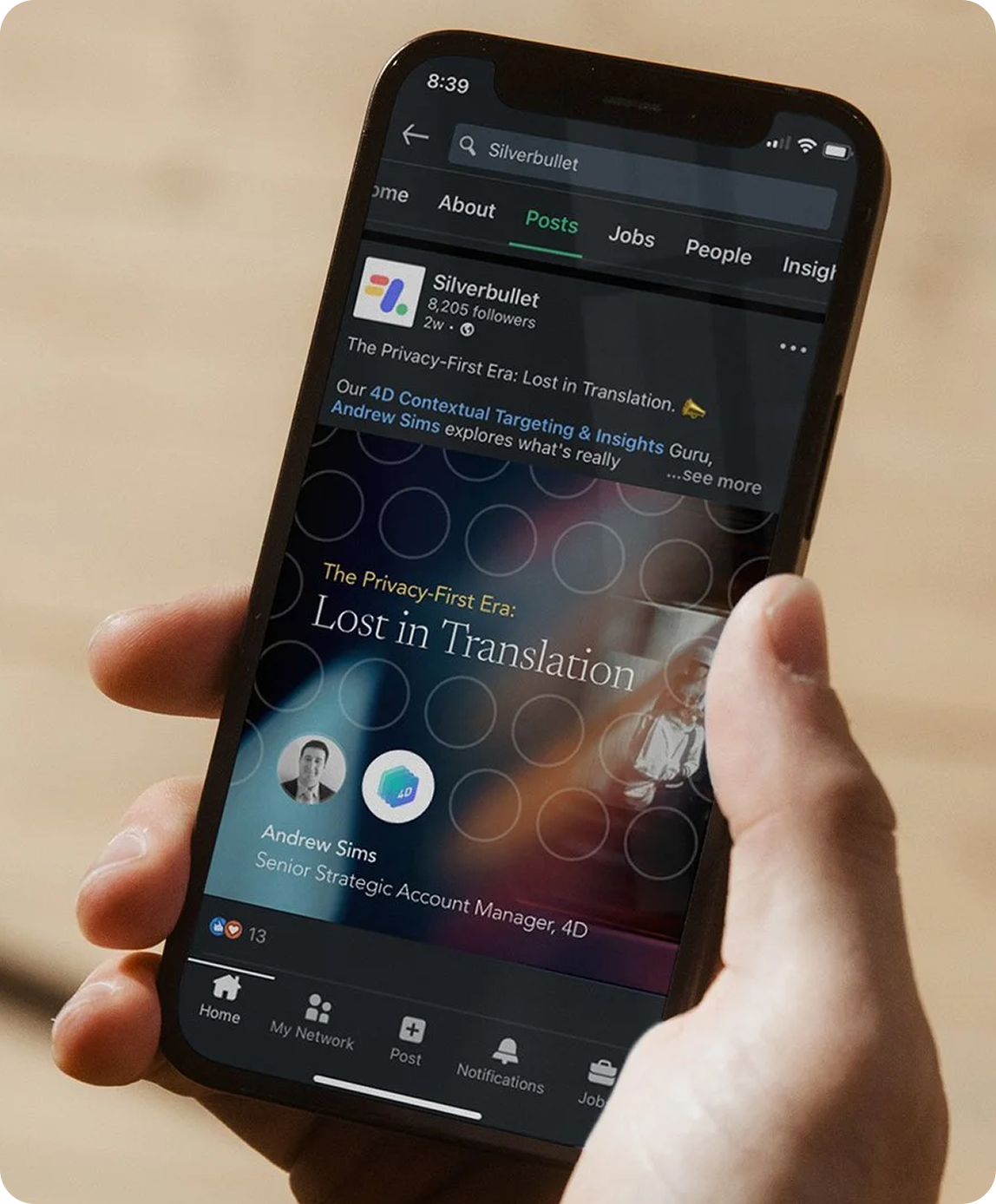
The new direction wasn’t confined to the website, we delivered material across key channels, namely Linkedin Social headers and sales materials so the brand showed up consistently wherever prospects met it.
